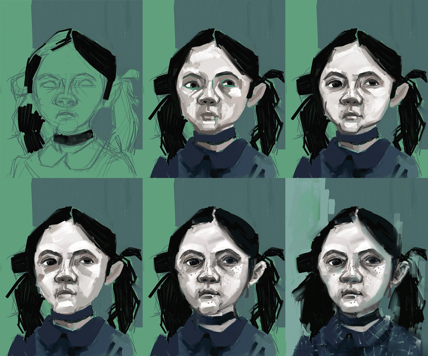
 i had a little bit more trouble with the wet media tools in corel painter than i did with the dry media. the brushes are really cool though it's just like using real paint. only your trying to paint realistically with a plastic stylus. i mostly used the wet impasto bush and adjusted the size and changed the opacity. i started off blocking out bascic shapes and i just layered. i actually liked how the different layers of paint interacted with each other.

This is such a fun painting process. You were obviously working in nice thick strokes. It really gives the piece life. I'd say if you were to keep going to think about how the soft touches influence the more rigid edges.
ReplyDeleteI love the blocky style of painting you used here, and the way you've done the same thing in the background makes the whole thing come together. I'm really into this one altogether.
ReplyDeleteIn many ways I think this one turned out better than your first because it addresses a lot of the issues I think the first had to contend with. It is one of the most painterly out of the bunch here by far. It might be a little too much, however- to the point where it feels like it's bordering sketch instead of finished piece. You could remedy that by throwing a handful of rounded edges in the piece and putting some more work into the girls hair, which currently feels rather flat compared to the rest.
ReplyDeleteI like how expressive both of your portraits are, also your color palette fits in perfectly with the creepy child theme. The Orphan girl has a very interesting blocky style and the background is simple, but pleasing to see. I think you could improve your dry medium portrait by adding more contrast to it. It seems to be in a hazy wheat colored fog.
ReplyDeleteThe choppiness of those brush strokes is what really makes this painting. The shadows surrounding the edges of her face are bit more soft in contrast, so it would be nice to see the same hard quality there as in the rest of painting. Wet media seemed like a lot of trouble for some people, but you've definitely found a great solution.
ReplyDeleteThese pieces are colored SO WELL. and the wet media one just has such a moodiness to it that makes it really dramatic and powerful. all your mark making is super interesting to look at all the impostos you added. I had a really hard time using any in my own piece so I might come back to look at this piece just as a reference or something to learn from!
ReplyDeleteI agree with Patty -- the way you are using the brush strokes in this one -- like, just putting down a mark and allowing it to show up as a mark, is really nice in this one. I love seeing your process here -- it's really interesting to see how you build up color. I love how you bring back the blue from the background into her face / hair - I think it really enriches the whole color palette - and unifies the piece. This has been a major theme in my comments on other people's work, too , and I find myself looking for it! I think the fact that you let the paint mix on the canvas is great and I'd totally encourage you to do it more!
ReplyDelete